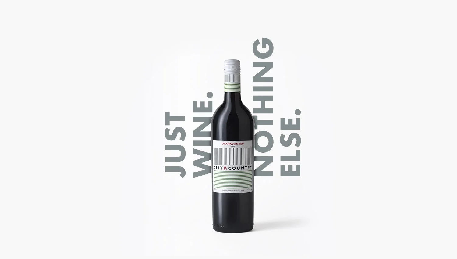
City & Country
CITY & COUNTRY URBAN WINERY
Brand Identity, Packaging, Animation, Launch Campaign, Retail Installation, Social Media Content
Project completed at C&B Advertising
A conceptual identity system based on the brand story
The idea behind the brand identity was to elegantly, and graphically translate the simplicity of the ingredients to a label that doesn’t get in the way of the taste. The name derives from the fact that it’s an urban winery, made from rural grapes, so vertical and horizontal lines were the most distilled way of saying “city” and “country”. That branding system allowed the typography throughout all other pieces help reinforce the original concept.

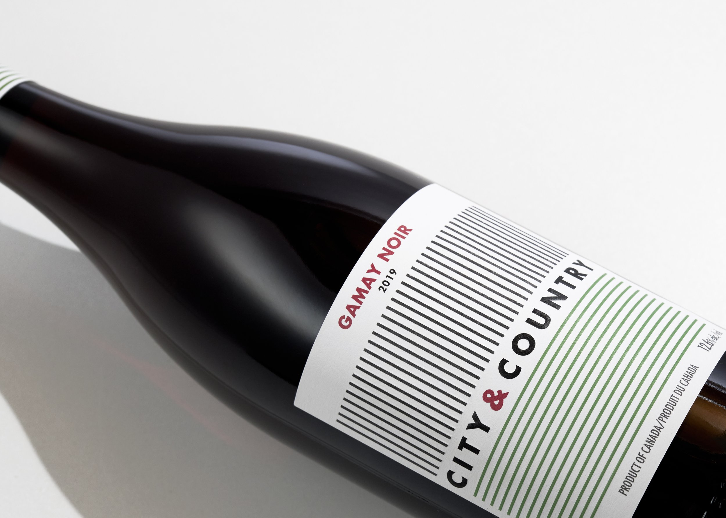


It was important that all our marketing pieces and ephemera maintained the vertical and horizontal feel of the brand. While unconventional in certain applications, it helped maintain the desired continuity and bring the brand to life.


The store interior was done in partnership with BOLD Workshop Architecture. The tasting room was designed to marry both the urban and rural aesthetic by using actual barnboard from the owner’s property mixed with a concrete look for the primary stations. The installation behind the main serving bar is an interpretation of the logo executed with wine bottles.

